A good way to start learning about infographics and data visualization is by looking at good examples of pieces created by other people. Thousands of them are created every year but this is my little selection of infographics and dataviz that, maybe are not the best, but for one reason or another, I like them. I could choose a hundred more, but I had to stick with just a few. (They are not ranked in any particular order)
(You can go to the real visualizations by clicking on the image)
Homicides in the District
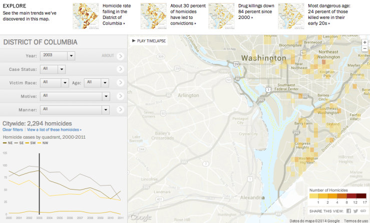
Homicides in the District, made by The Washington Post
I think this fact checker made by The Washington Post is a great example of data visualization. Not only for the way of displaying it, but also for the 15 months of investigation behind it.
The Post tracked all homicides in D.C. between 2000 and 2011 to learn what happened to each case. It helps find homicides in each neighborhood and see citywide trends and is a very easy to use app.
You can check the app built by The Washington Post here
Napoleon’s Russian Campaign
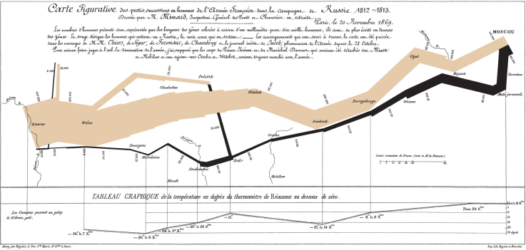
The line in this graph shows how Napoleon’s army was getting smaller as they got further in Russia. Source: DataViz Blog
We don’t need to come to the Internet era to find examples of great infographics. Charles Minard, a French engineer, illustrated the disastrous result of Napoleon’s Russian campaign in 1812. This chart shows the strength of the Grande Armée as it marched to Moscow and back, getting smaller as they advanced.
Analysing London 2012

Analysing London 2012, created by GoSquared
Sometimes infographics just need to be clear, interesting, interactive and add a little fun like this live infographic about the London 2012 Olympic games from GoSquared does, showing some of the huge numbers that dominated the games. Scrolling through this interactive infographic takes you through Olympic trivia, much of which you have probably never heard, instead of focusing in the facts that we all know about the games.
Can you live on the minimum wage?
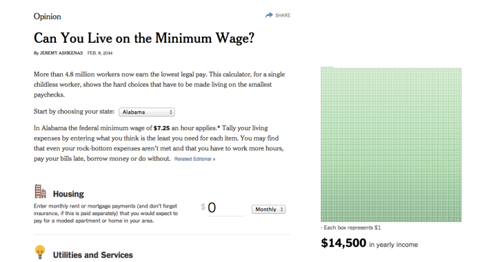
«Can you live on the minimum wage?» by The New York Times analyses the money you really need to survive
Earlier this month, The New York Times created this interactive visualization that works as a calculator and helps you find out if you would have enough money to pay all your expenses earning the minimum wage an hour. For sure, lots of people would find surprising how fast the money goes down and you find yourself in negative numbers with big debts.
Evert last drop

Every last drop is an interactive infographic showing the use of water on a daily base
This interactive scrolling site made by the creative agency Nice&Serious in partnership with Waterwise is a visual journey through daily water usage and saving water in a very easy and self explanatory way. It takes a look at how much water we waste on a daily basis and how small changes can make a big difference. It ends up with a video adding more explanation.
As a bonus track, this is the infographic that is believed to be the first one ever published in Spain. This graphic of a volcano and the emergence of an island in the Azores published September 8, 1638 is considered by journalist Mario Tascón as the first infographic of Spanish journalism.

According to journalist Mario Tascón, this is the first infographic in Spanish journalism. Source: Cooking Ideas
Sources:
